

Variables are a basic tool that help organize colors on a project. For a long time, front-end engineers used preprocessor variables to configure colors on a project. But now, many developers prefer the modern native mechanism for organizing color variables: CSS Custom Properties. Their most important advantage over preprocessor variables is that they work in realtime, not at the compilation stage of the project, and have support for the cascade model which allows you to use inheritance and redefinition of values on the fly.
When you’re trying to organize an application color scheme, you can always place all custom properties that relate to color in the root section, name them, and use it in all needed places.
See the Pen [Custom Properties for Colors](https://codepen.io/smashingmag/pen/RwaNqxW) by Artur Basak.
That’s an option, but does it help you to resolve issues of application theming, white labeling, a brand refresh, or organizing a light or dark mode? What if you need to adjust the color scheme to increase contrast? With the current approach, you will have to update each value in your variables.
In this article, I want to suggest a more flexible and resistant approach on how to split color variables using custom properties, which can solve many of these issues.
Setup Color Palette
The coloring of any website begins with the setup of a color scheme. Such a scheme is based on the color wheel. Usually, only a few primary colors form the basis of a palette, the rest are derived colors — tones and mid-tones. Most often, the palette is static and does not change while the web application is running.
According to the color theory, there are only a few options for color schemes:
- Monochromatic scheme (one primary color)
- Complementary scheme (two primary colors)
- Triad scheme (three primary colors)
- Tetradic scheme (four primary colors)
- Adjacent pattern (two or three primary colors)
For my example, I will generate a triad color scheme using the Paletton service:
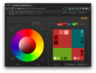
I now have three main colors. On the basis of these, I will calculate the tones and mid-tones (the HSL format in combination with the calc function is a very useful tool for this). By changing the lightness value, I can generate several additional colors for the palette.
See the Pen [HSL Palette](https://codepen.io/smashingmag/pen/OJNPaQW) by Artur Basak.
Now if the palette is modified, then it will be necessary to change only the value of the primary colors. The rest will be recalculated automatically.
If you prefer HEX or RGB formats, then it does not matter; a palette can be formed at the stage of compiling the project with the corresponding functions of the preprocessor (e.g. with SCSS and the color-adjust function). As I’ve mentioned before, this layer is mostly static; it’s extremely rare that the palette may be changed in a running application. That’s why we can calculate it with preprocessors.
Note: I recommend also generating both HEX literal and RGB for each color. This will allow playing with the alpha channel in the future.
See the Pen [SCSS Palette](https://codepen.io/smashingmag/pen/oNxgQqv) by Artur Basak.
The palette level is the only level where the color is encoded directly in the variable names, i.e. we can uniquely identify the color by reading the name.
Define Theme Or Functional Colors
Once the palette is done, the next step is the level of functional colors. At this level, the value of the color is not so important as its purpose, the function it performs, and what it exactly colorizes. For example, the primary or app brand color, border color, color of the text on a dark background, the color of the text on a light background, button background color, link color, hover link color, hint text color, and so on.
These are extremely common things for almost any website or application. We can say that such colors are responsible for a certain color theme of the application. Also, the values of such variables are taken strictly from the palette. Thus, we can easily change application themes by simply operating with different color palettes.
Below, I have created three typical UI controls: a button, a link, and an input field. They are colored using functional variables that contain values from the palette that I previously generated above. The main functional variable that is responsible for the application theme (conditional brand) is the primary color variable.
Using the three buttons at the top, you can switch themes (change the brand color for controls). The change occurs by using the appropriate CSSOM API (setProperty).
See the Pen [Functional Colors](https://codepen.io/smashingmag/pen/poyvQLL) by Artur Basak.
This approach is convenient not only for theming but also for configuring individual web pages. For example, on the zubry.by website, I used a common stylesheet and a functional variable --page-color to colorize the logo, headings, controls, and text selection for all pages. And in the own styles of each page, I just redefined this variable to set the page its individual primary color.

Use Component Colors
Large web projects always contain decomposition; we split everything into small components and reuse them in many places. Each component usually has its own style meaning it doesn’t matter what we used to decompose BEM or CSS Modules, or another approach; it’s important that each such piece of code can be called local scope and reused.
In general, I see the point in using color variables at the component level in two cases.
The first is when components that according to application style guide are repeated with different settings, e.g. buttons for different needs like primary (brand) button, secondary button, tertiary, and so on.
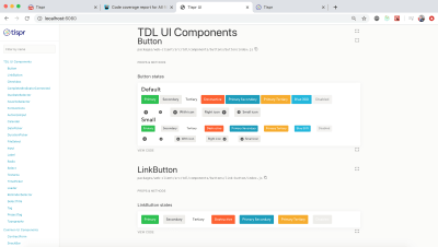
The second is when components that have several states with different colors, e.g. button hover, active and focus states; normal and invalid states for input or select field, and so on.
A more rare case when component variables may come in handy is the functionality of a “white label”. The “white label” is a service feature that allows the user to customize or brand some part of the user interface to improve the experience of interacting with their clients. For example, electronic documents that a user shares with his customers through a service or email templates. In this case, the variables at the component level will help to configure certain components separately from the rest of the color theme of the application.
In the example below, I’ve now added controls for customizing colors of the primary (brand) button. Using color variables of the component level we can configure UI controls separately from each other.
See the Pen [Component Colors](https://codepen.io/smashingmag/pen/LYNEXdw) by Artur Basak.
How To Determine What Level A Variable Has?
I came across the question of how to understand what can be put in the root (theme or functional level), and what to leave at the level of a component. This is an excellent question that is difficult to answer without seeing the situation you are working with.
Unfortunately, the same approach as in programming does not work with colors and styles, if we see three identical pieces of code then we need to refactor it.
Color can be repeated from component to component, but this does not mean that it is a rule. There can be no relation between such components. For example, the border of the input field and the background of the primary button. Yes, in my example above that’s the case, but let’s check following example:
See the Pen [Color Split: Only Palette](https://codepen.io/smashingmag/pen/YzqPRLX) by Artur Basak.
The dark gray color is repeated — this is the border of the input field, the fill color of the close icon, and the background of the secondary button. But these components are in no way connected with each other. If the border color of the input field changes, then we will not change the background of the secondary button. For such a case we must keep here just the variable from the palette.
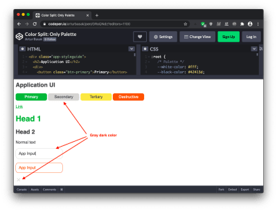
What about green? We can clearly define it as the primary or brand color, most likely, if the color of the main button changes, then the color of the link and header of the first level will also change.
What about red? Invalid state of input fields, error messages, and the destructive buttons will have the same color at the whole application level. This is a pattern. Now I can define several common functional variables in the root section:
See the Pen [Color Split: Functional Level](https://codepen.io/smashingmag/pen/MWyYzGX) by Artur Basak.
Regarding the level of component colors, we can easily identify components that can be customized using custom properties.
The button is repeated with different settings, the background color and text for different use cases change — primary, secondary, tertiary, destructive or negative case.
The input field has two states — incorrect and normal, where the background and border colors differ. And so, let’s put these settings into color variables at the level of the corresponding components.
For the rest of the components, it is not necessary to define local color variables, this will be redundant.
See the Pen [Color Split: Component Level](https://codepen.io/smashingmag/pen/BaKyGVR) by Artur Basak.
You need to dive into the pattern language of your project, which is, probably, being developed by the design team and UX. Engineers must fully understand the whole concept of a visual language, only then we can determine what is common and should live on a functional level, and what should remain in the local scope of visibility.
But everything is not so complicated, there are obvious things. The general background of the page, the background, and color of the main text, in most cases this is what sets the theme of your application. It is extremely convenient to collect such things that are responsible for the configuration of a particular mode (like dark or light mode).
Why Not Put Everything In The Root Section?
I had such an experience. On Lition project, the team and I were faced with the fact that we needed to support IE11 for the web application, but not for the website and landings. A common UI Kit was used between the projects, and we decided to put all the variables in the root, this will allow us to redefine them at any level.
And also with this approach for the web application and IE11 case, we simply passed the code through the following post-processor plugin and transformed these variables into literals for all UI components in the project. This trick possible only if all variables were defined in the root section because the post-processor can’t understand the specifics of the cascade model.

Now I understand that this was not the right way. Firstly, if you put component colors into the root section, then you break the separation of concerns principle. As a result, you can end up with redundant CSS in the stylesheet. For example, you have the folder of components where each component has its own styles. You also have a common stylesheet where you describe color variables in the root section. You decide to remove the button component; in this case, you must remember to also remove the variables associated with the button from the common styles file.
Secondly, this is not the best solution in terms of performance. Yes, a color change causes only the process of a repaint, not reflow/layout, this in itself is not too costly, but when you make some changes at the highest level, you will use more resources to check the entire tree than when these changes are in a small local area. I recommend reading the performance benchmark of CSS variables from Lisi Linhart for more details.
On my current project Tispr, the team and I use split and do not dump everything in the root, on the high level only a palette and functional colors. Also, we are not afraid of IE11, because this problem is solved by the corresponding polyfill. Just install npm module ie11-custom-properties and import library into your application JS bundle:
// Use ES6 syntax
import "ie11-custom-properties";
// or CommonJS
require('ie11-custom-properties');
Or add module by script tag:
<script async src="./node_modules/ie11-custom-properties/ie11CustomProperties.js">Also, you can add the library without npm via CDN. The work of this polyfill is based on the fact that IE11 has minimal support for custom properties, where properties can be defined and read based on the cascade. This is not possible with properties starting with double dashes, but possibly with a single dash (the mechanism similar to vendor prefixes). You can read more about this in the repository documentation, as well as get acquainted with some limits. Other browsers will ignore this polyfill.
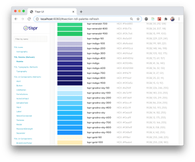
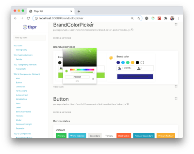
Below is a palette of the Tispr web application as well as the controls of the “white label” functionality for the e-documents (such as user contracts, invoices, or proposals).
Why Not Store Color Variables On The JavaScript Side?
Another reasonable question: why not store the palette and function variables in JavaScript code? This can also be dynamically changed and later redefined colors through inline styles. This could be an option, but most likely this approach would be less optimal since you need to have access to certain elements and change their color properties. With CSS variables, you will only change a single property, i.e. the variable value.
In JavaScript, there are no native functions or API for working with colors. In the CSS Color Module 5, there will be many opportunities to make derived colors or somehow calculate them. From the perspective of the future, CSS Custom Properties are richer and more flexible than JS variables. Also, with JS variables, there will be no possibility to use inheritance in cascade and that’s the main disadvantage.
Conclusion
Splitting colors into three levels (palette, functional, and component) can help you be more adaptive to changes and new requirements while working on a project. I believe that CSS Custom Properties are the right tool for organizing color split — it does not matter what you use for styling: pure CSS, preprocessors, or CSS-in-JS approach.
I came to this approach through my own experience, but I’m not alone. Sara Soueidan described in her article a similar approach in which she split variables into global and component levels.
I would also like to suggest reading the Lea Verou’s article where she describes possible cases of applying CSS variables (not only in terms of color).
 (ra, yk, il)
Website Design & SEO Delray Beach by DBL07.co
source http://www.scpie.org/how-to-configure-application-color-schemes-with-css-custom-properties/

No comments:
Post a Comment